Why College Crests Keep Their Shape on Small Objects
Learn how college crests stay legible on patches and stationery by simplifying tiny details while keeping the shapes and symbols that identify them.
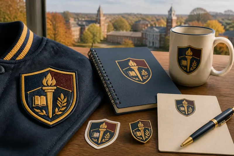
A college crest can look crisp on a letterhead and turn to visual clutter on a jacket patch. College crest design for small objects starts with a simple task: decide which shapes must remain recognizable, then adapt the rest to the material and size. You can use that approach to judge a patch, notebook, sticker, or other compact keepsake before choosing one.
What makes a crest recognizable?
Look at the crest from across a counter or on a phone screen. Notice what catches your eye first: the shield outline, a large central symbol, a distinctive band of color, or a short motto. Those are likely to carry more identity than tiny decorative marks.
A crest usually combines several kinds of information: its outer silhouette, divisions within that silhouette, symbols, lettering, and color. On a small object, they compete for limited space. The goal is not to preserve every stroke. It is to preserve the visual hierarchy: the main form first, the defining emblem next, and supporting details only when they can still be read.
Try a quick viewing check. Reduce the image on your phone until it is close to the size of the object you are considering. If the outline and central emblem still make sense, the design has a good foundation. If the motto becomes a dark stripe or the shield’s compartments merge, the art needs simplification before production.
Which details should stay?
Make a short priority list before comparing versions. Start with the features that distinguish this crest from a generic shield. A school’s unusual silhouette may matter more than a fine border; a recognizable torch may matter more than a small flourish around it.
- Outer contour: Keep a distinctive shield, circle, or other enclosing shape intact.
- Main emblem: Preserve the central object or figure in a form that reads at a glance.
- Large divisions: Retain the main panels or bands if they help identify the crest.
- Color relationships: Keep important contrasts between adjoining areas.
- Lettering: Include words only if the intended object can show them clearly.
- Small ornament: Remove curls, dots, and thin rules that add noise without aiding recognition.
This is a ranking, not a universal recipe. A crest built around its initials may depend on lettering. Another may be identified by an animal or a distinctive color arrangement. Compare the simplified version with the original at the actual viewing size, not only as a large image on a computer.
How should you adapt the crest to the object?
Start with the object’s surface and process. A stitched patch is made from thread and fabric, so thin lines and tiny gaps can close up or disappear. Printed stationery can preserve finer outlines, but a small card still gives miniature lettering little room to breathe. A sticker or enamel pin brings its own limits, such as a fixed outline or separate color areas.
For embroidery, favor broad shapes, clear borders, and open space between neighboring elements. Ask to see the stitch artwork, not just a smooth digital mockup. Thread has visible texture, and tightly packed detail can lose its separation when stitched. If the crest has a motto, consider omitting it from the patch rather than shrinking it until it becomes a narrow band.
For printed stationery, look for a version with clean linework and enough contrast against the paper. A small crest placed beside a name or address should not compete with the text. If the original uses several close shades, a simplified palette may help separate its parts without changing the main silhouette.
For an object with a constrained shape, check whether the design is being cropped, squeezed, or rearranged. A shield stretched to fit a narrow label can lose its character. It is generally better to preserve the proportions and give the crest more breathing room than to fill every available corner.
How can you compare two small versions?
Imagine you are choosing between two campus patches. One keeps the full motto, border curls, and tiny inner symbols; the other drops the motto and curls but preserves the shield, its main divisions, and the central torch. At jacket distance, the second version should be easier to recognize because its most important shapes have room to register. The useful question is not which version contains more detail, but which one remains distinct on the object you will actually use.
Use a consistent comparison:
- View both designs at the intended physical size, using a printed proof or a correctly scaled image.
- Step back to the distance from which the object is likely to be seen.
- Check whether the outer contour remains clear.
- Identify the central emblem without zooming in.
- Look for merged lines, crowded lettering, or color areas that blend together.
- Choose the version whose defining features remain intact, and ask for a revised proof if neither does.
That comparison helps separate a useful simplification from an arbitrary redesign. The emblem should lose only what cannot survive the scale or medium; it should not be reshaped merely to fill a blank area.
What should you ask before choosing a crest item?
Should a tiny motto remain on a patch?
Keep it only if the letters are visibly separated and readable at the patch’s actual size. If they form a dense stripe, a version without the motto may communicate the crest more clearly.
Why do embroidered lines look heavier?
Thread creates a textured edge, and closely spaced stitches can visually crowd one another. Broad strokes and open gaps tend to hold their shape better than hairline details.
Is a one-color crest less authentic?
Not necessarily. A simplified color treatment can retain the silhouette and emblem, but compare it with the school’s approved artwork before treating it as an official version.
What should I check on a printed proof?
Inspect the smallest lines, the spaces between symbols, the contrast against the paper, and the crest’s proportions. If the vendor’s proof does not show the intended size clearly, ask for a scaled preview.
How do you decide whether the simplification works?
Return to the original priority list and compare each item with the finished design. The main outline should still be present; the defining emblem should still read; any retained words should be legible rather than decorative texture. Check the object itself if you can, since a screen preview cannot fully convey the feel of fabric, paper, or a raised print.
When the right version depends on the school’s approved artwork, a manufacturer’s process, or local licensing rules, follow those requirements and ask the campus shop or rights holder for clarification. For an ordinary purchase, the practical choice is the crest that keeps its identity at the scale and on the material where it will live.
College crest design for small objects is at its best when each surviving detail has a job. Before buying, glance at the object from a natural viewing distance and name the shape or emblem you recognize first. If the defining feature is clear without searching through visual clutter, the simplification is doing its work.